Alphabet Zoo

An exhibit by Cyrus Highsmith

サイラス
ハイスミス個展

Book&
Design

111–0032 東京都台東区浅草 2–1–14
2–1–14 3F Taito-ku Tokyo

Alphabet Zoo is a window into the graphic world of Cyrus Highsmith. His playful creative process and the joy he gets from mechanical reproduction are on display in this collection of screen prints, monoprints, and etchings. Drawings of animals and the letters of the latin alphabet, pulled from the pages of his numerous sketchbooks, form the basis for the series of images created for this exhibit. It’s an energetic and free-spirited collection of work.

Process & Practice

I often look for drawing and printing techniques that I cannot control completely. I design my creative process so unexpected things can happen. This helps me to keep a playful state of mind and enjoy myself while I work.

Sometimes this can be as simple as using a brush that’s too big. Sometimes I make my own drawing tool so I have to learn how to use it as I am working. I try to embrace a tool’s awkwardness and observe what happens. This kind of thinking also defines my approach to printmaking.

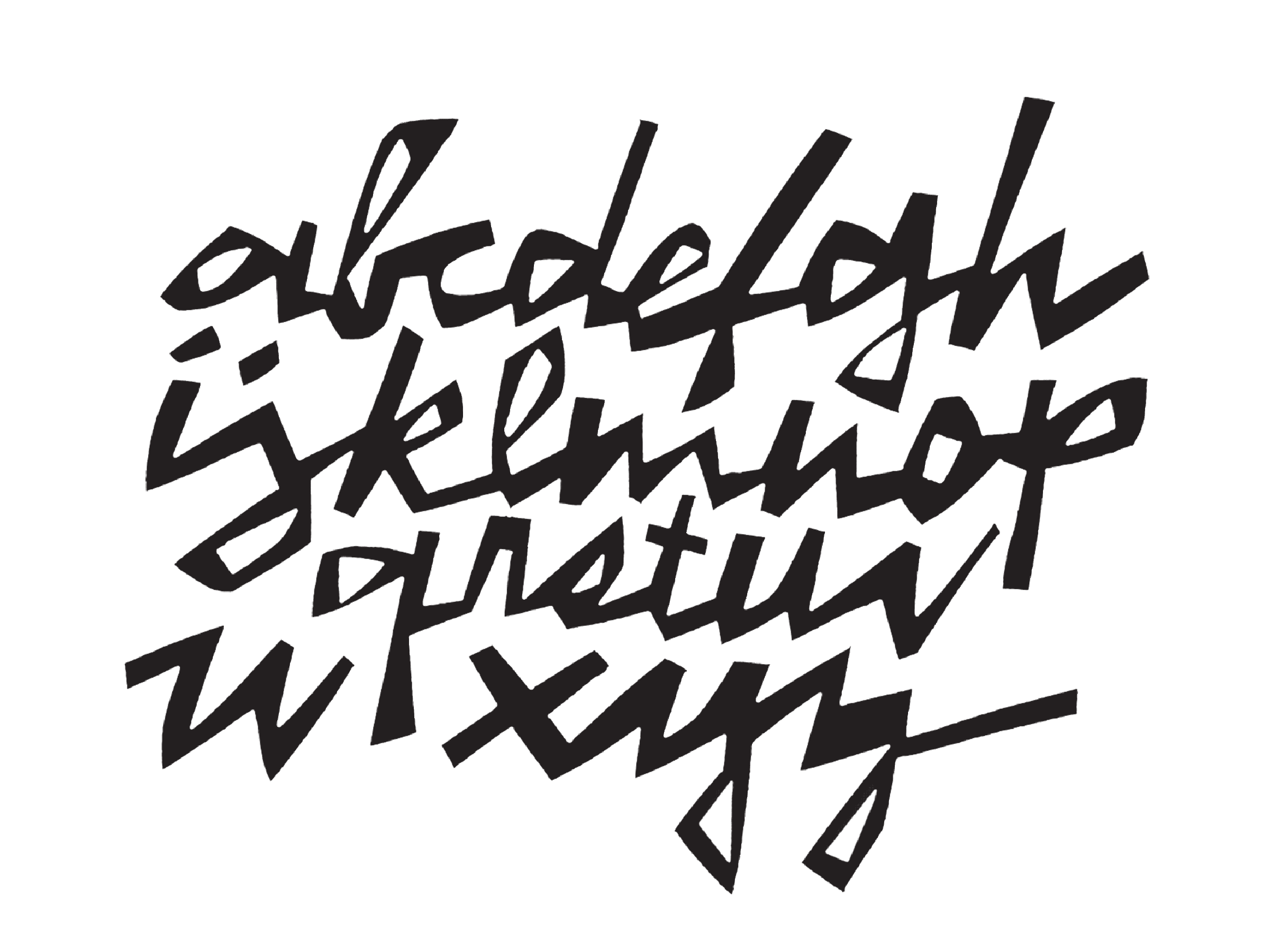
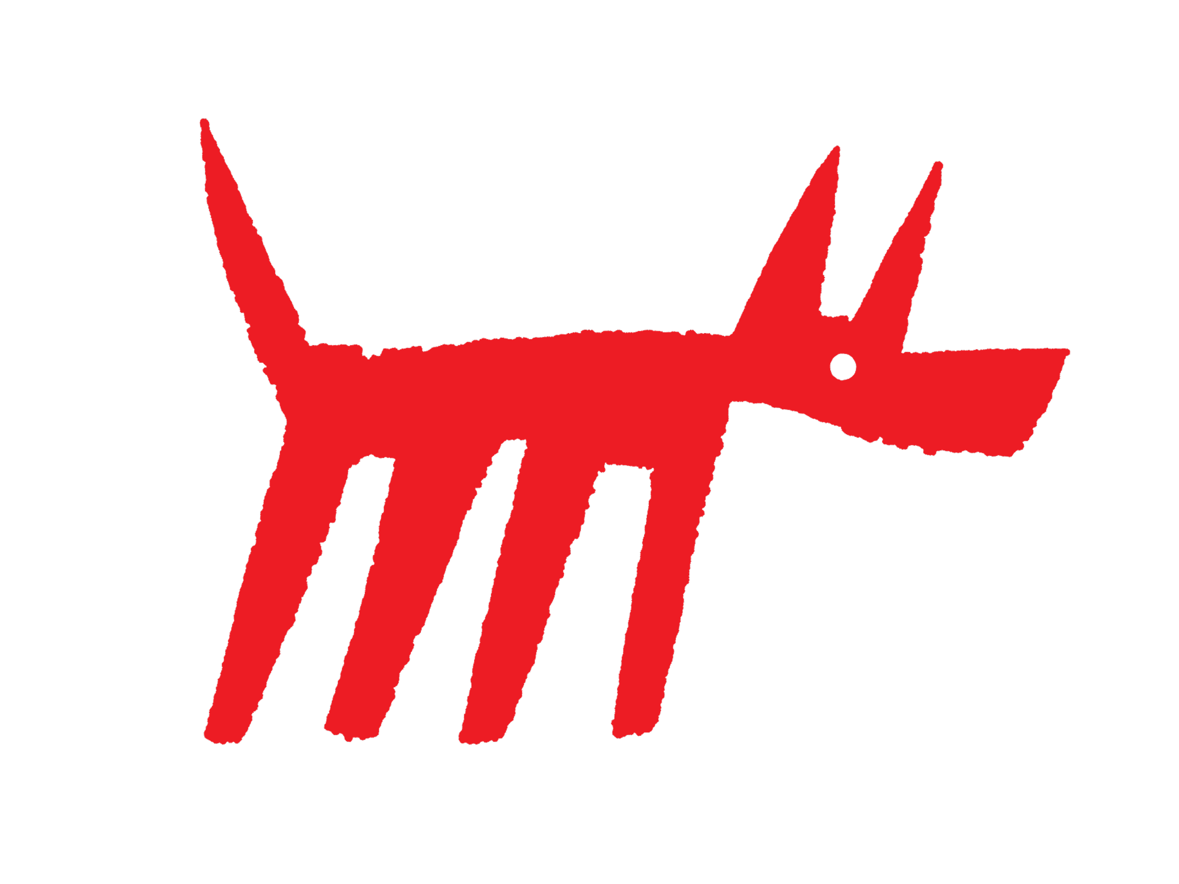
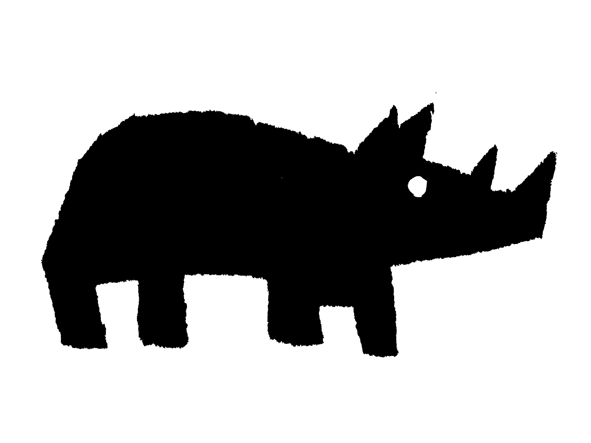
My favorite printmaking method is screen printing with paper stencils. I cut and tear the stencils by hand from newsprint. I think of it as a “low-resolution” technique. The fibers in the flimsy paper mean it cannot take much detail when it gets cut. It forces me to think of the images in terms of simple shapes and pay attention to space between the cuts.

This is an old screen printing method that avoids having to make film and use chemicals. The paper stencils aren’t sturdy enough for printing very large editions and there is a limit to how big I can make the images. Most of the time, I enjoy these limitations.

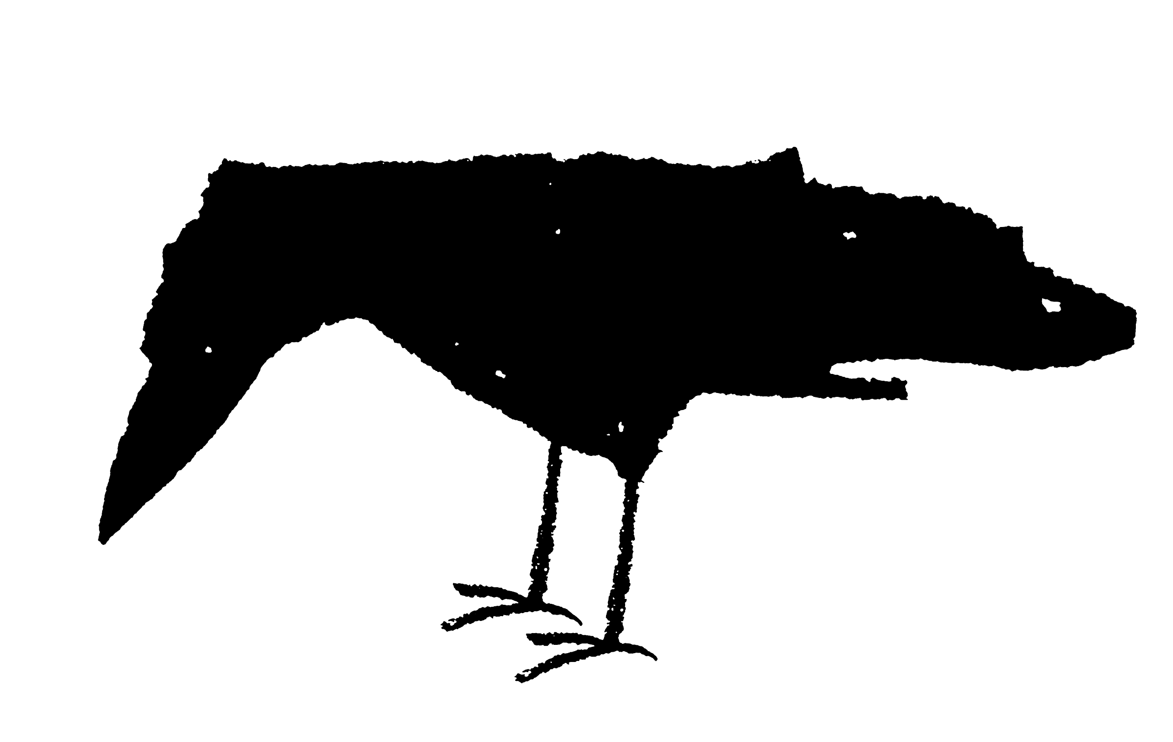
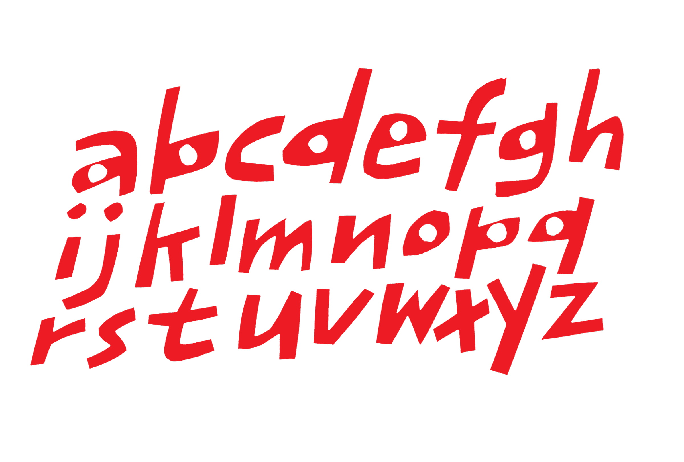
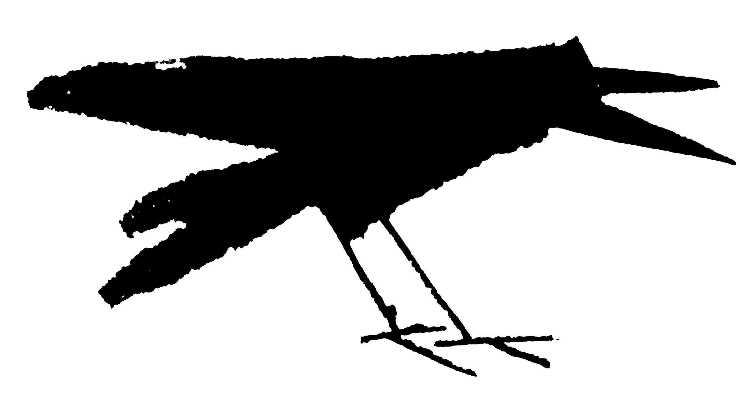
When I need to get around them, I work with a commercial printer. For this exhibit, The Head Light produced the large screen prints from artwork I created with x-acto knives and brushes. The crow aquatints were made by the master printer, Jim Stroud at Center Street Studio.

I don’t really understand how aquatinting works but the results have deep rich flat blacks that I could never get on my own. Crows seemed like the perfect subject for this collaboration. I created the artwork by enlarging tiny drawings made using a calligraphy pen with a modified nib in my sketchbook.

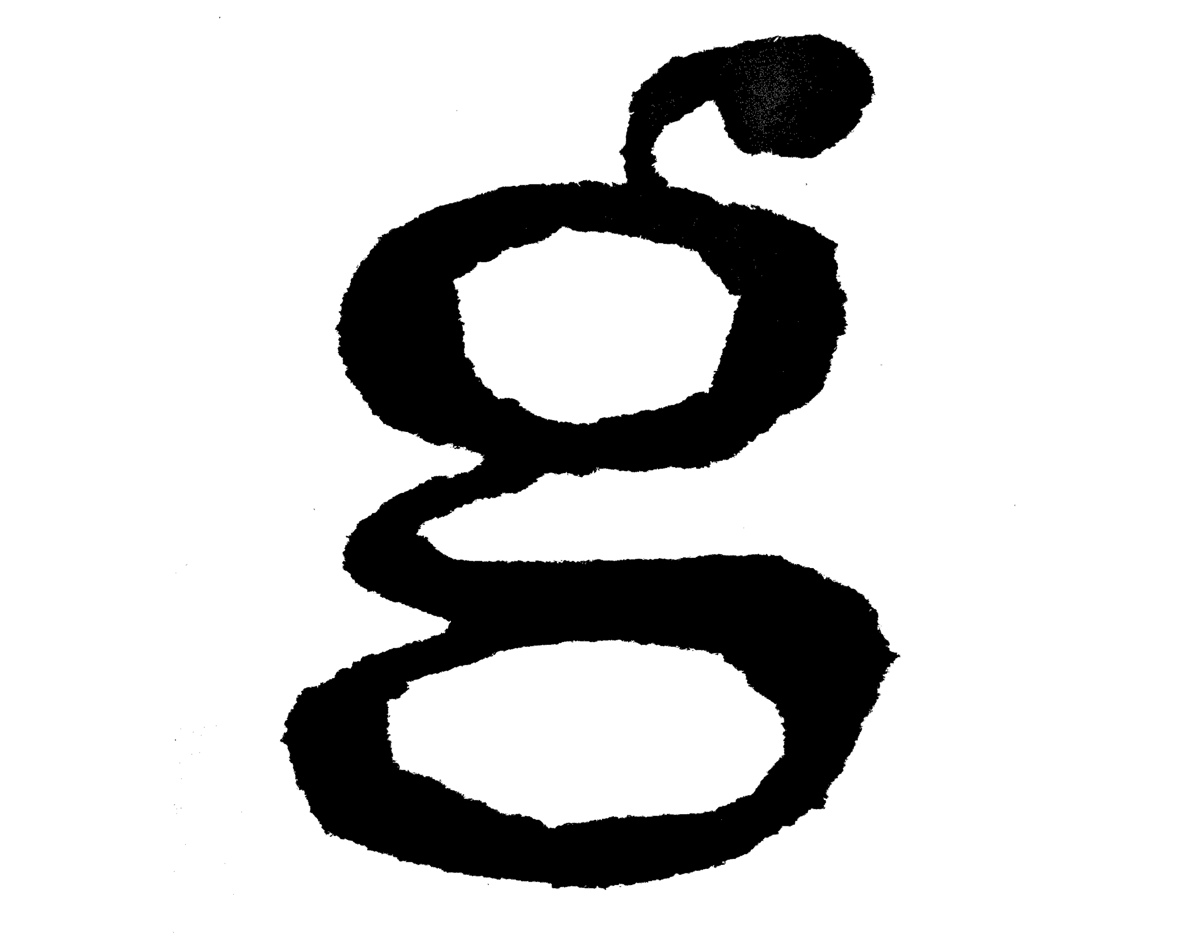
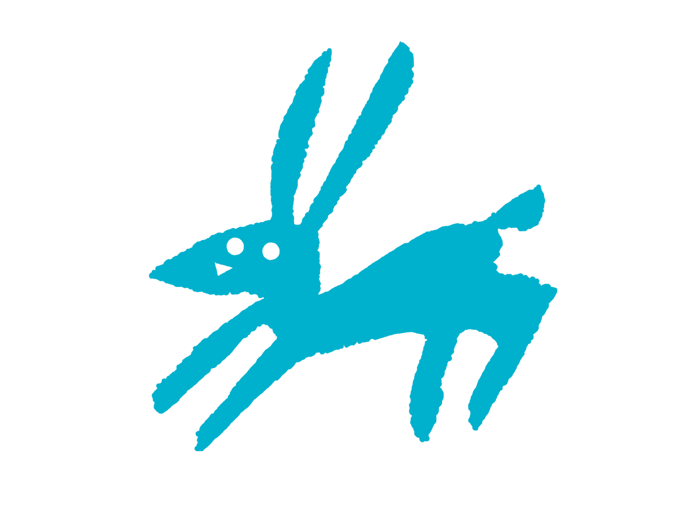
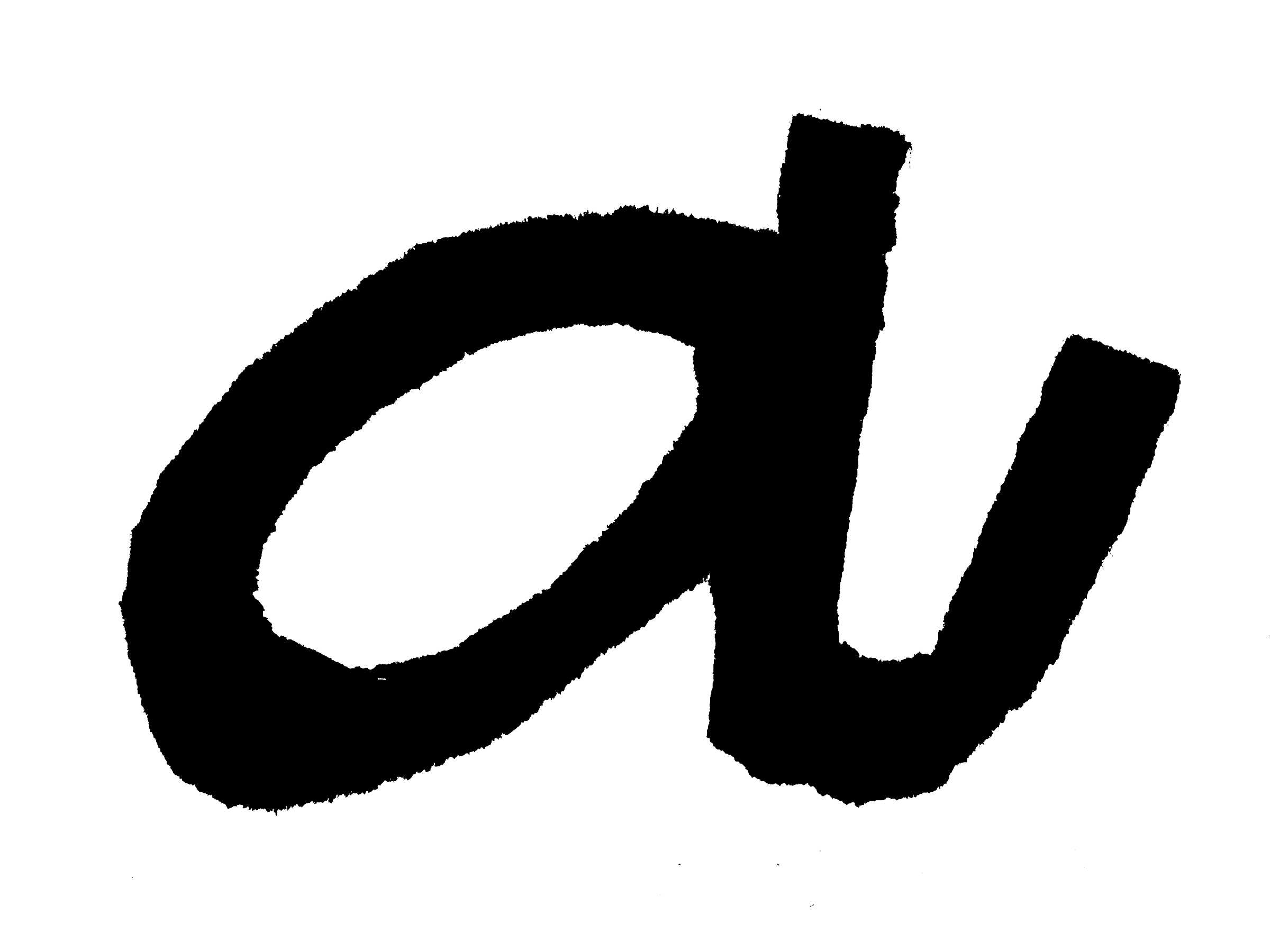
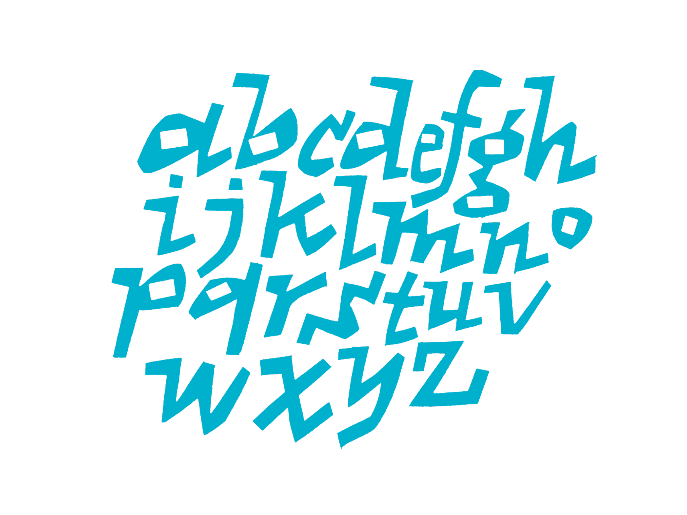
Most of the images for this exhibit came from my sketchbooks. In my sketchbooks, I draw letters, people, animals, chairs, monsters—anything that I am interested in. Sometimes I draw with a pencil or a pen, sometimes I use a brush or a knife. These aren’t preparatory drawings for other work. These are drawings I make for the sake of drawing.

For the last thirty years, I have tried to draw in my sketchbooks at least a little bit everyday. There are almost two hundred full books stashed away in boxes around my studio. It’s the thread that runs through my entire career.

I design typefaces, illustrate books, and make prints. I teach and write. My sketchbooks are where all these things get mixed up and ferment. That’s why they are such an essential part of my practice.

My ultimate goal is to learn to draw the way that I draw. That sounds simple but I’m still working on it.


— Cyrus Highsmith

Cyrus Highsmith

Highsmith is a letter drawer, teacher, author, and graphic artist. He teaches type design at Rhode Island School of Design (RISD). He wrote and illustrated the acclaimed primer Inside Paragraphs: Typographic Fundamentals. In 2015, he received the Gerrit Noordzij Prize for extraordinary contributions to the fields of type design, typography, and type education. In 2017, Morisawa acquired his type foundry, Occupant Fonts, and he became their Creative Director for Latin Type Development.
occupantfonts.com | morisawa.co.jp

About

All images © 2022–2023 Cyrus Highsmith
Exhibit coordination: S2 Corporation, Book&Design
Typefaces: Magmatic Variable and Ibis Text by Occupant Fonts, Gothic MB101 and Reimin by Morisawa.
Site design & development: Marie Otsuka

Contact

Book&Design is a publishing house run by Yuko Miyago specializing in art and design books. The space hosts book and design-related exhibitions, along with talk events and workshops.
book-design.jp | [email protected]

Access

2–1–14 3F, Asakusa, Taito-ku, Tokyo 111–0032
The gallery is located in a white building next to the Asahi Bank. Please go up the stairs to the third floor. Unfortunately, there are no elevators available.

The nearest station is Asakusa Station.
Tobu Sky-tree line (north exit) 1 minute walk
Tokyo Metro Ginza line, G19 (exit 7) 3 minute walk
Toei-Asakusa line (exit A5) 6 minute walk
Google Maps

お問い合わせ

Book&Design: アート・デザイン書専門の出版社。書籍やデザイン関連の展覧会、トークイベント、ワークショップなどを開催している。
ホームページ | [email protected]

アクセス

111–0032 東京都台東区浅草2–1–14 3
朝日信用金庫と焼鳥扇屋さんの間。大通り沿いの階段からお入りください。エレベーターはございません。

東武スカイツリーライン 浅草駅(北口)から徒歩1
東京メトロ銀座線 浅草駅(松屋方面改札)から徒歩3
都営浅草線 浅草駅(松屋方面改札)から徒歩6
マップ

サイラス・ハイスミス

サイラス・ハイスミスは、書体デザイナーで、文字や絵を手で描くグラフィックアーティスト。アメリカの美大ロードアイランド・ スクール・オブ・デザイン(RISD)でタイプデザインを教えている。タイポグラフィの入門書『欧文タイポグラフィの基本』の執筆と挿絵を担当。2015年、タイプデザイン、タイポグラフィ、教育分野への卓越した貢献に対してゲリット・ ノルツァイ賞を受賞。2017年、モリサワUSAの欧文書体開発 のクリエイティブディレクターに就任。
occupantfonts.com | morisawa.co.jp

詳細

掲載画像 © 2022–2023 Cyrus Highsmith
主催: S2 Corporation, Book&Design
書体: Occupant Fonts Magmatic VariableIbis Text, モリサワ ゴシックMB101黎ミン
ウェブデザイン・開発: 大塚万里衣

「過程と実践」

私はしばしば、自分では完全にコントロールできないドローイングやプリントのテクニックを探す。予想外のことが起こるように、創作プロセスをデザインする。そうすることで、遊び心を持ち、楽しみながら仕事をすることができる。

時には、大きすぎるブラシを使うような単純なこともする。自分でドローイングツールを作ることもあり、作業しながらその使い方を学んでいる。道具の使いにくさを受け入れ、何が起こるかを観察しているのだ。このような考え方は、私の版画へのアプローチも定義している。

私の好きな版画法は、型紙を使ったスクリーン・プリントだ。型紙は新聞紙を手で切ったりちぎったりする。これを「低解像度」の技法だと考えている。ペラペラの紙は繊維が多いので、カットするときにディテールをあまり表現できない。そのため、イメージを単純な形で考え、カットとカットの間のスペースに注意を払わなければならない。

これは古いスクリーン印刷の方法で、フィルムを作ったり化学薬品を使ったりする必要がない。型紙はあまり大きな版を刷るには丈夫ではないし、イメージを大きくするにも限界がある。この制限が楽しい。

それを回避する必要があるときは、専門の印刷会社に依頼する。今回の展示では、ザ・ヘッドライトが、私がカッターナイフとブラシを使って制作した作品から大きなスクリーンプリントを制作してくれた。カラスのアクアチントは、センター・ストリート・スタジオのマスター・プリンター、ジム・ストラウドによって作られた。

私はアクアチントがどのように機能するのかよく理解していないが、その結果、深みのある豊かでフラットな黒が生まれた。

カラスはこのコラボレーションに最適な被写体のように思えた。ペン先が改造されたカリグラフィーペンを使用してスケッチブックに描いた小さなドローイングを拡大してアートワークを作った。

この展示のほとんどのイメージは私のスケッチブックから生まれている。スケッチブックには、文字、人物、動物、椅子、モンスターなど、興味を持っているものを描いている。鉛筆やブラシで描く時もあれば、ブラシやナイフを使うこともある。これらは他の作業のための下絵ではなく、描くこと自体が目的なのだ。

過去三十年間、毎日少なくとも何かしらをスケッチブックに描くように心がけている。スタジオには二百冊ほどのスケッチブックがダンボールにしまわれている。それらは私のキャリアを紡ぐ糸のようだ。

私は書体をデザインし、挿絵に溢れた本を書き、プリントを制作する。教えたり執筆したりもする。スケッチブックはこれらすべてが混ざり合って熟成する場所だ。それが実践の中で非常に重要な部分なのだ。

私の究極の目標は、自分が描くように描くことを学ぶこと。単純に聞こえるが、私はまだその作業と向き合っている。

サイラス・ハイスミス

Alphabet Zoo」は、サイラス・ハイスミス日本初の個展です。 彼はアメリカのロードアイランドで書体デザイナーとして活動しながら、絵本の挿絵などのアートワークも手がけてきました。本個展では、彼が描いた動物やアルファベットの文字をスクリーンプリントやエッチングで表現した作品を展示します。会場では、 作品のほか、関連書籍やポストカードなども販売する予定です。遊び心あふれる彼の作品をお楽しみください。

Alphabet Zoo

文字と動物